SCAPEGRACE WHISKY
Packaging
2022
Food & Beverage
PROJECT SCOPE
Packaging
AWARDS
NZ Best Awards – Silver
Australian AGDA Awards – Merit
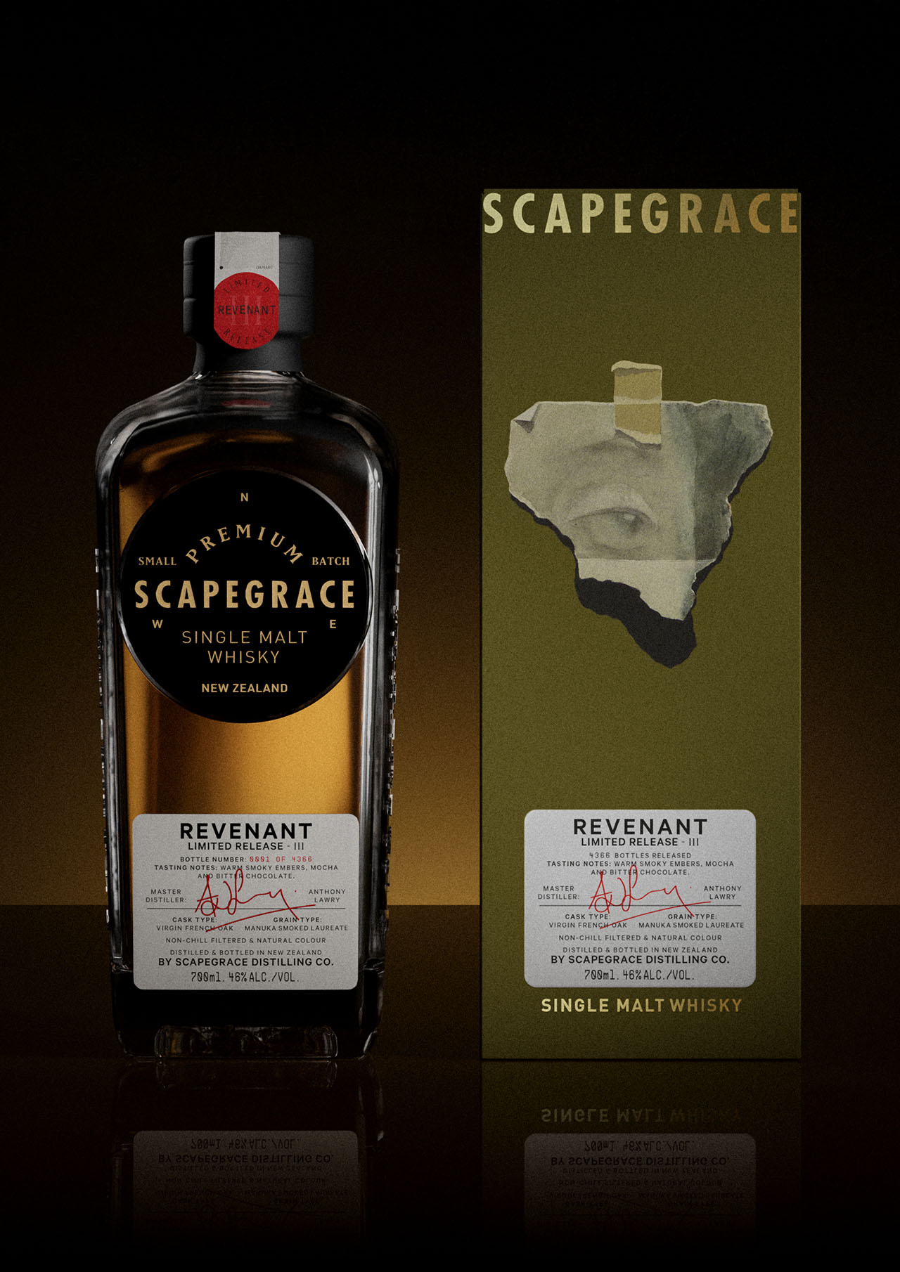
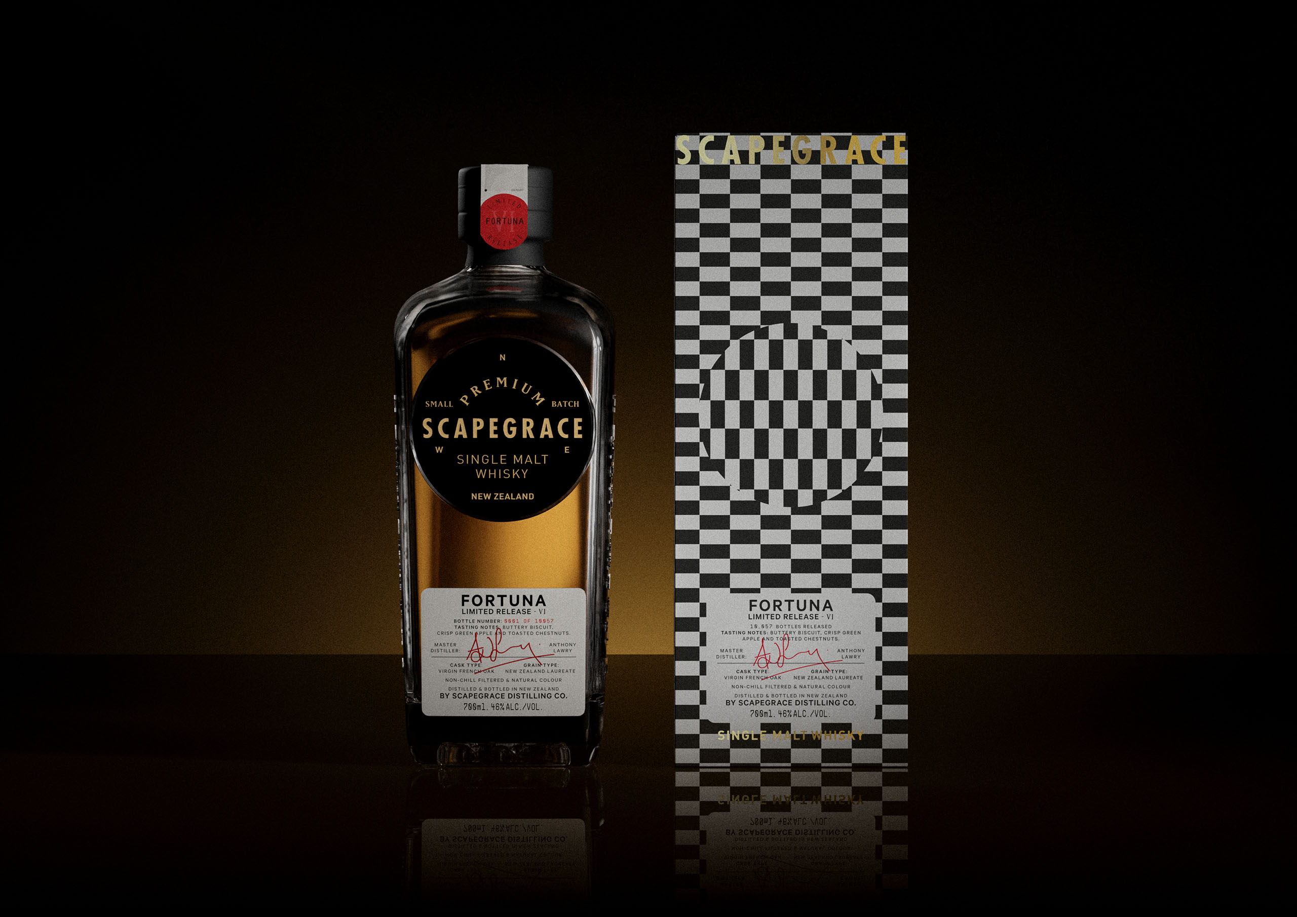
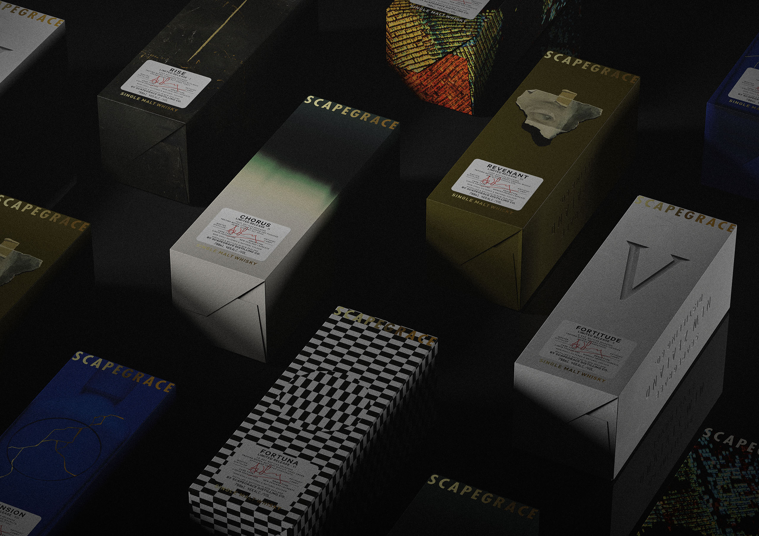
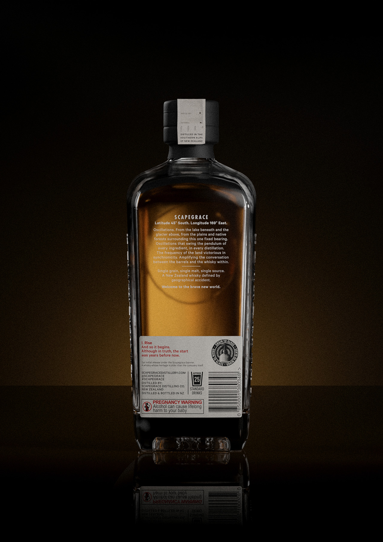
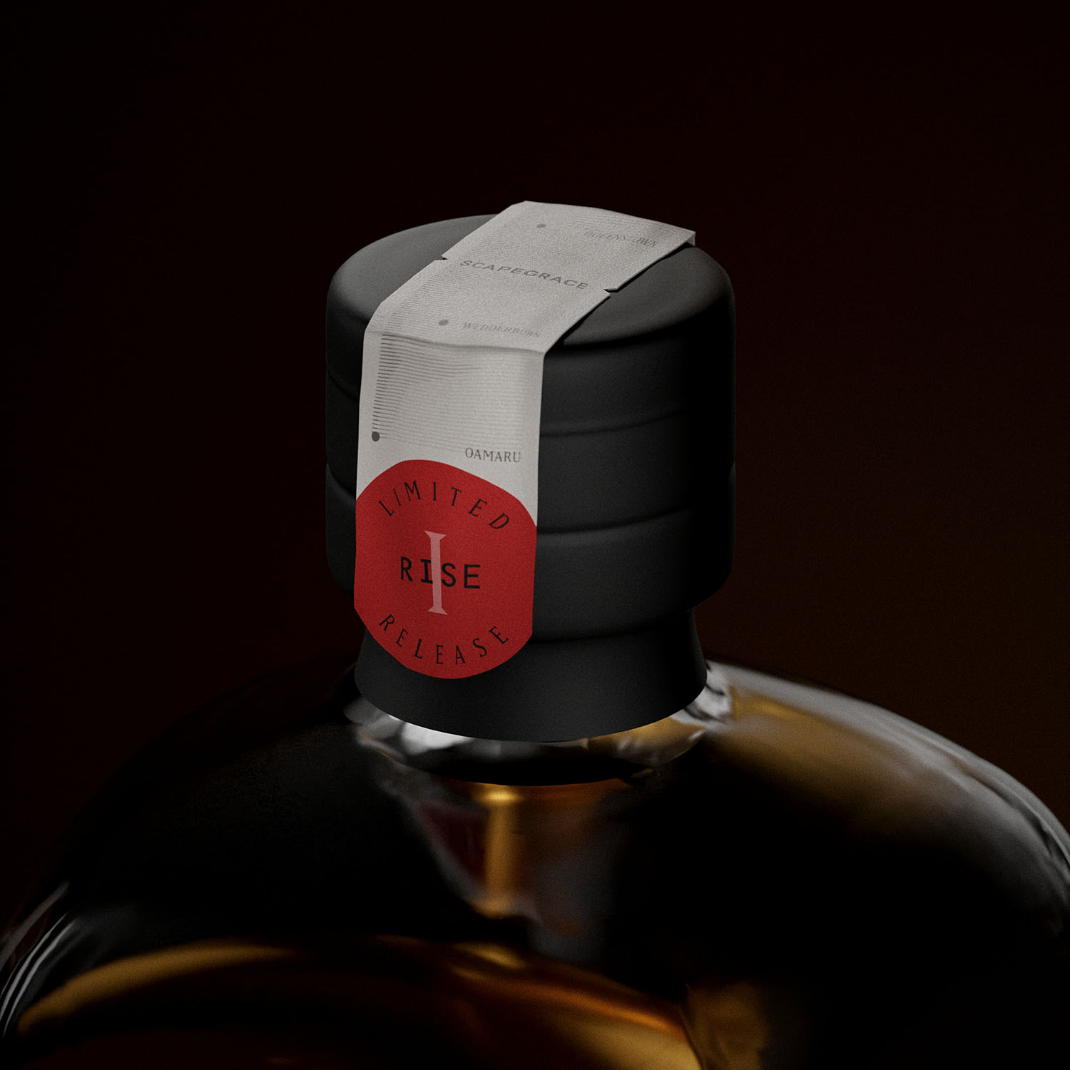
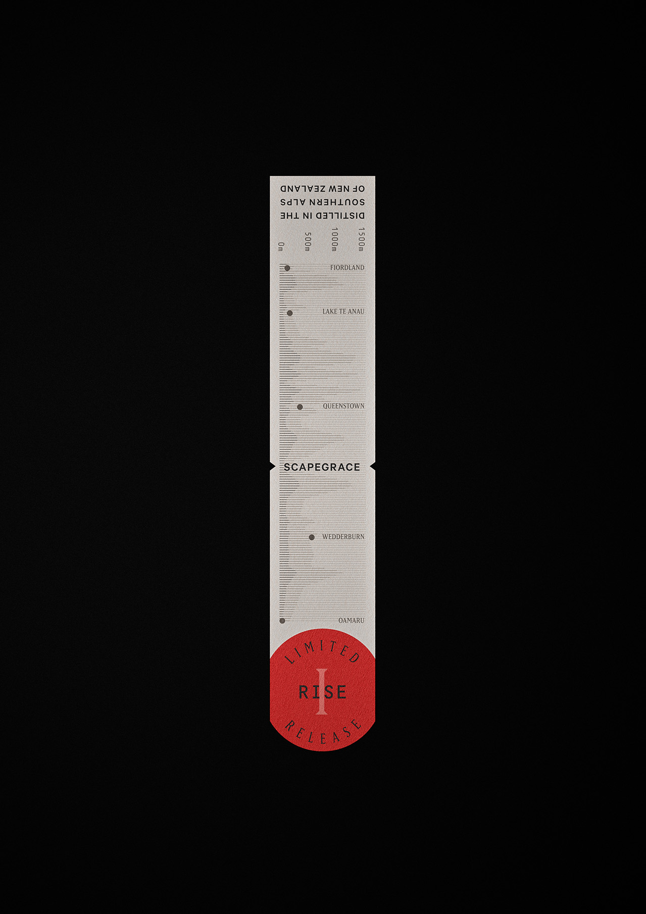
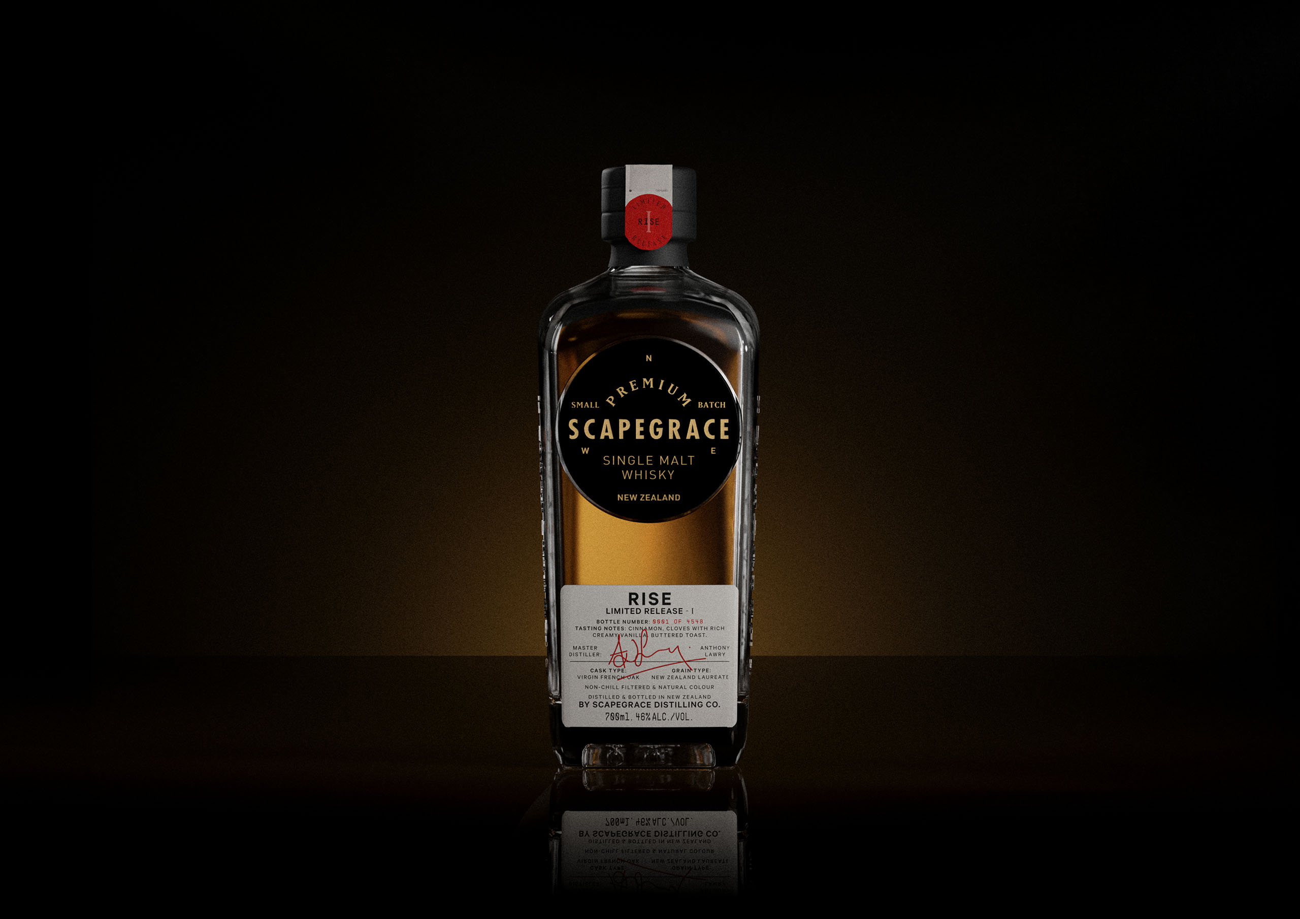
For nearly ten years Scapegrace have built a reputation creating award winning spirits. With their foray into the world of whisky, they tasked us to develop their new single malt packaging. With a new whisky bottle drawing heavily on the established silhouettes of its gin and vodka counterparts, it was differentiated by being shorter, heavier and more masculine in form. Keeping consistency with Scapegrace’s iconic circular disks provided an obvious link to the other products in the Scapegrace family.
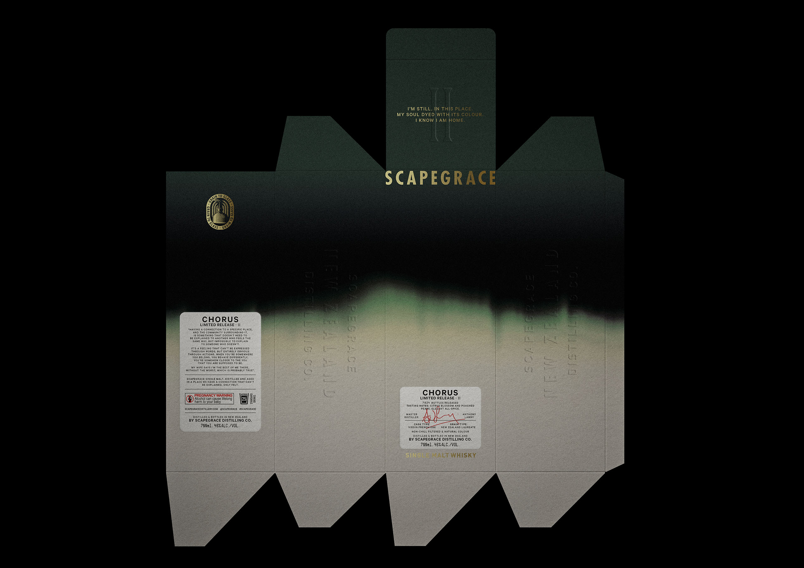
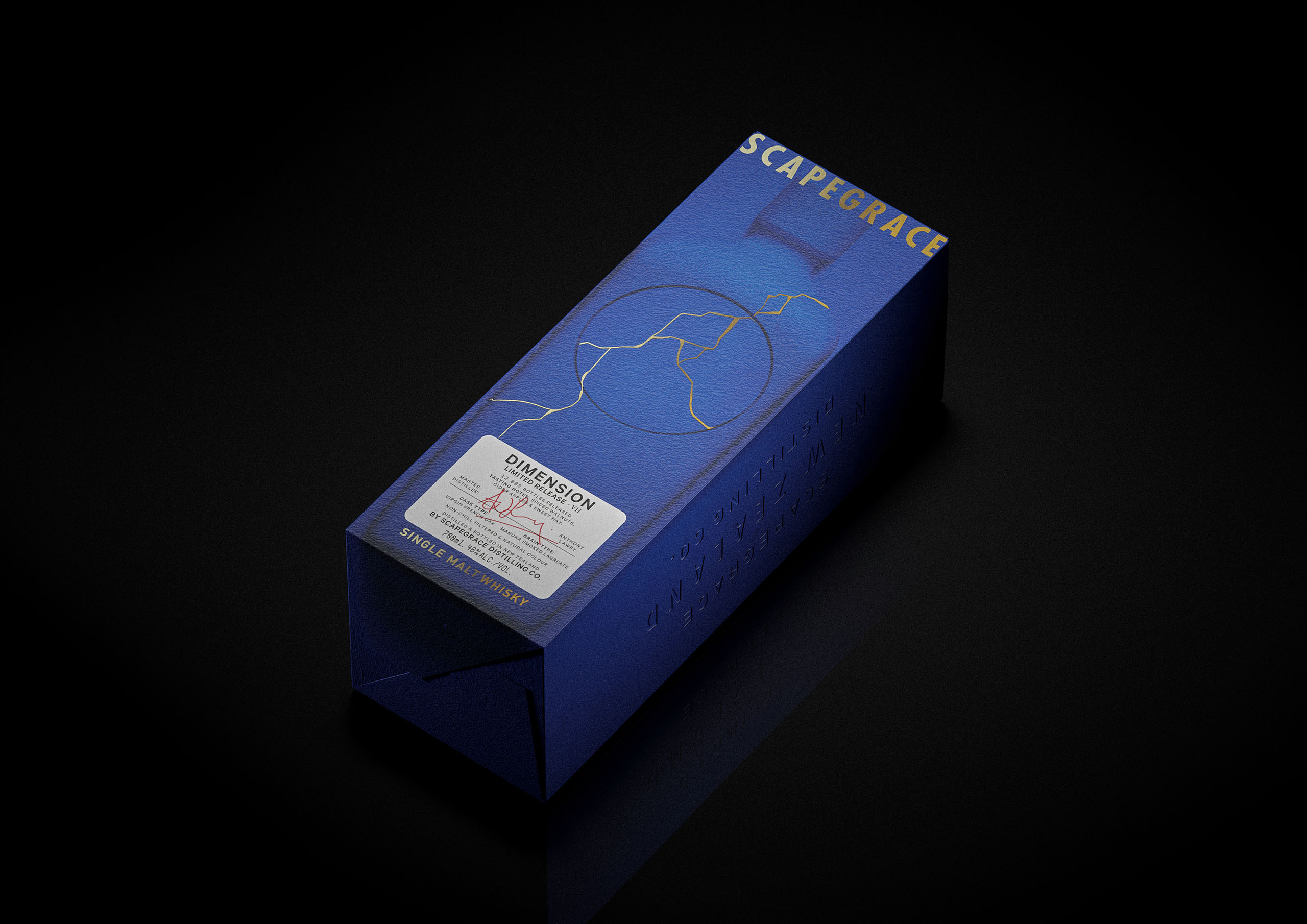
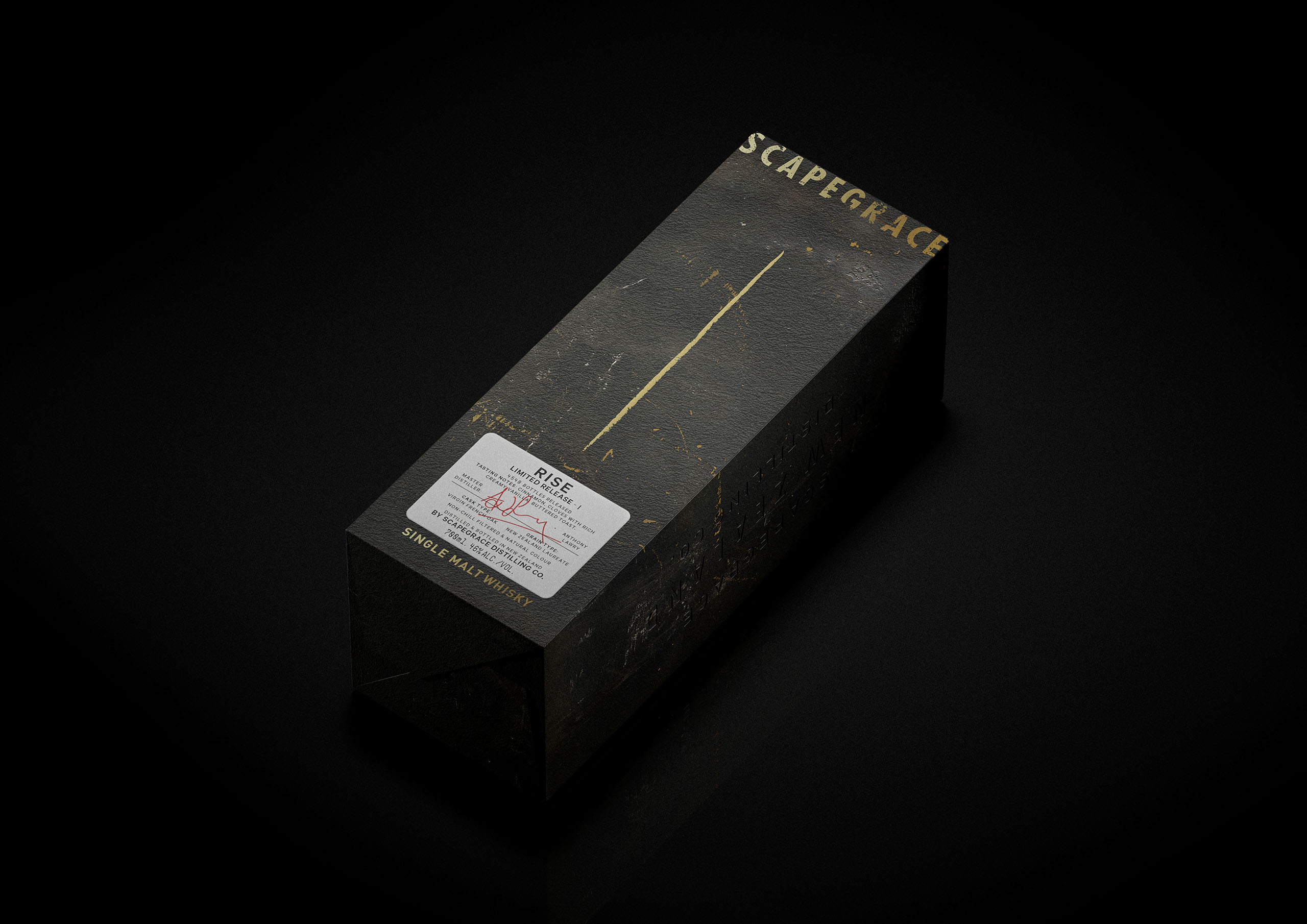
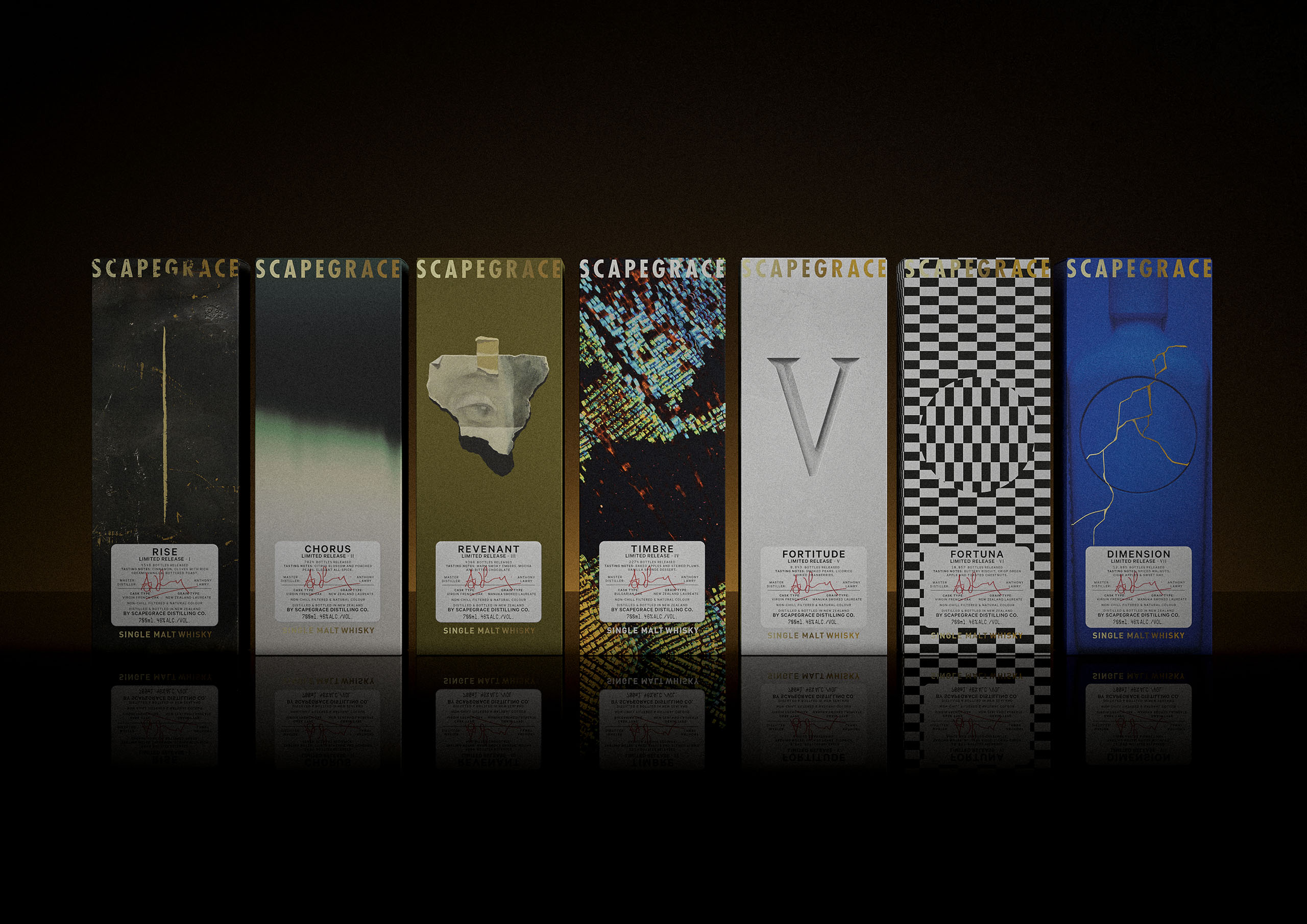
When it came to labelling, the whisky required a construct that could easily be adapted for future releases both on the bottle itself and the gift box in which they would be merchandised. Each limited release was guided by a unique haiku, either highlighting a functional element or an underlying belief of Scapegrace itself. The Haiku is derived from a process of distillation in literary form, its structure and philosophy mirrors that of the physical whisky-making process.
Imagery for each gift box was drawn from the haiku’s poetic content. As each release was limited it made sense to expand the visual treatment with a bespoke design for each box. It was also a way for Scapegrace to announce itself in the whisky world, by doing things unconventionally. To balance the unorthodox approach of the gift box designs, whisky cues were dialled up on the label taking inspiration from the typography used in traditional spirits labelling.