SCAPEGRACE GIN & TONIC
Packaging
2026
Food & Beverage (FMCG)
PROJECT SCOPE
Packaging
Design Communication
Digital
Animation
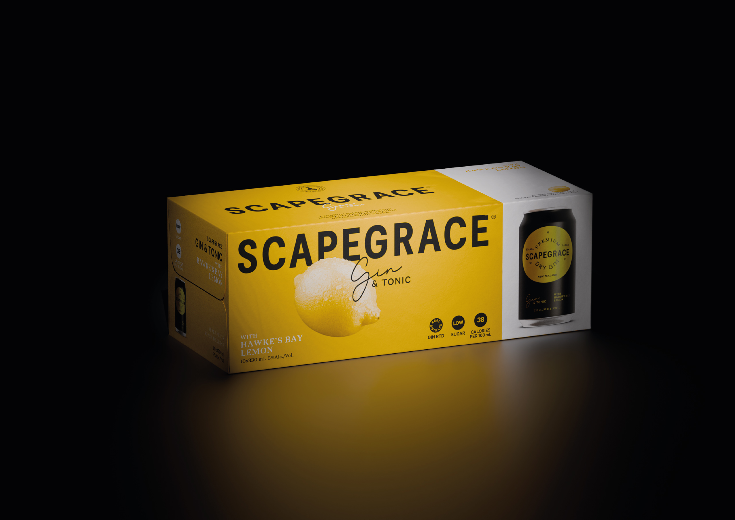
The RTD category is intensely competitive, with brands fighting for attention in a crowded retail environment. The challenge was to create a distinctive on-shelf presence while remaining unmistakably Scapegrace.
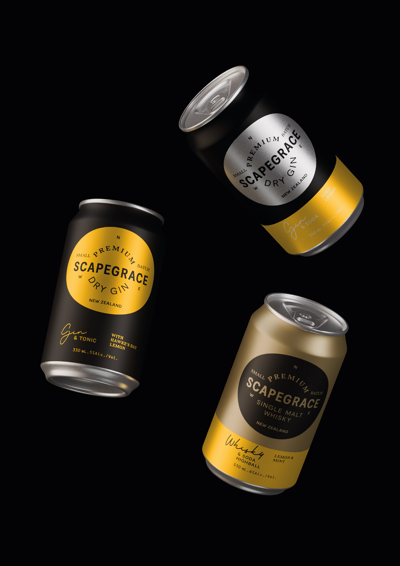
The concept embraced simplicity, reducing the design to only what was essential. Mirroring the product itself, the packaging reflects a short list of quality ingredients crafted with integrity.
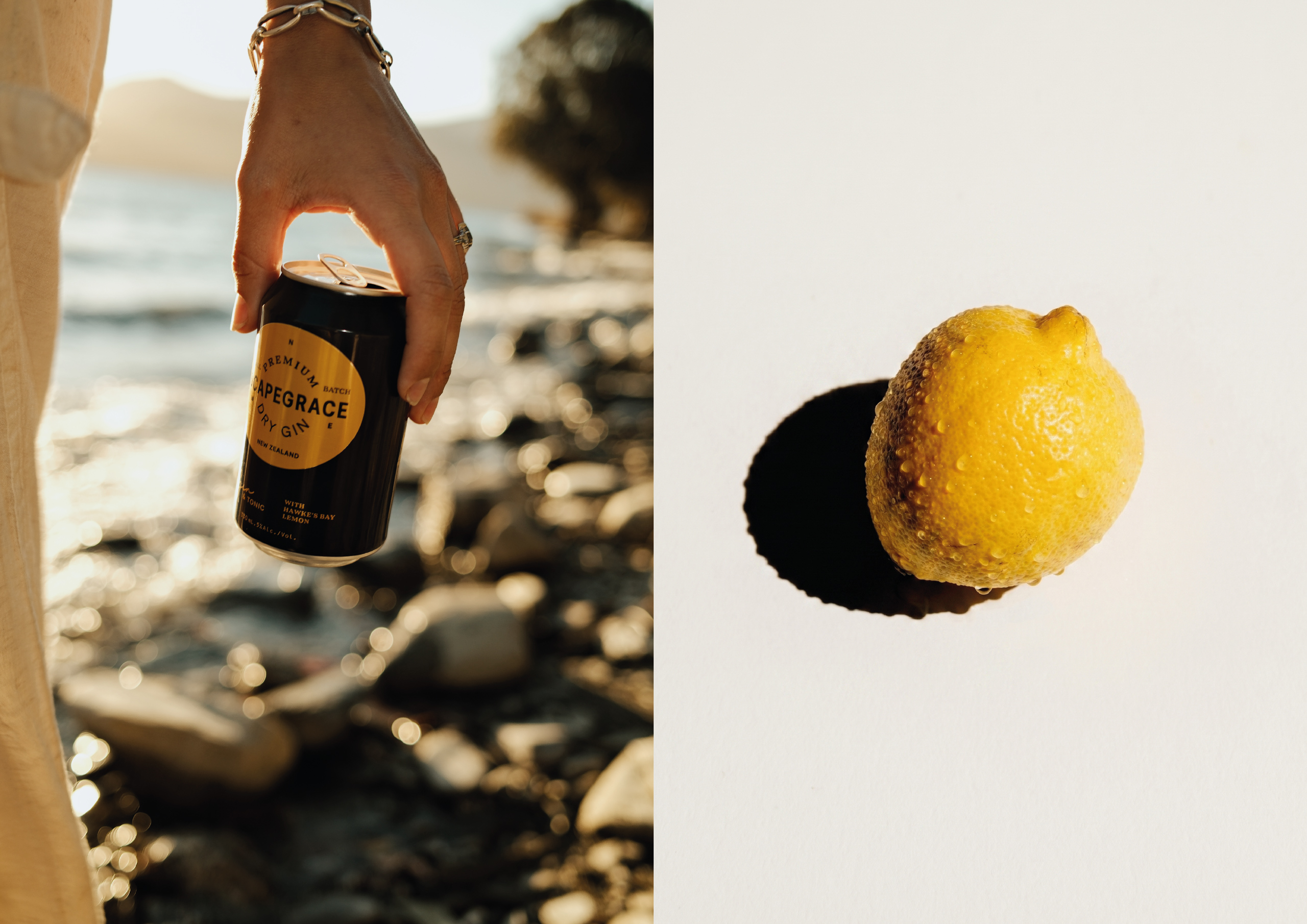
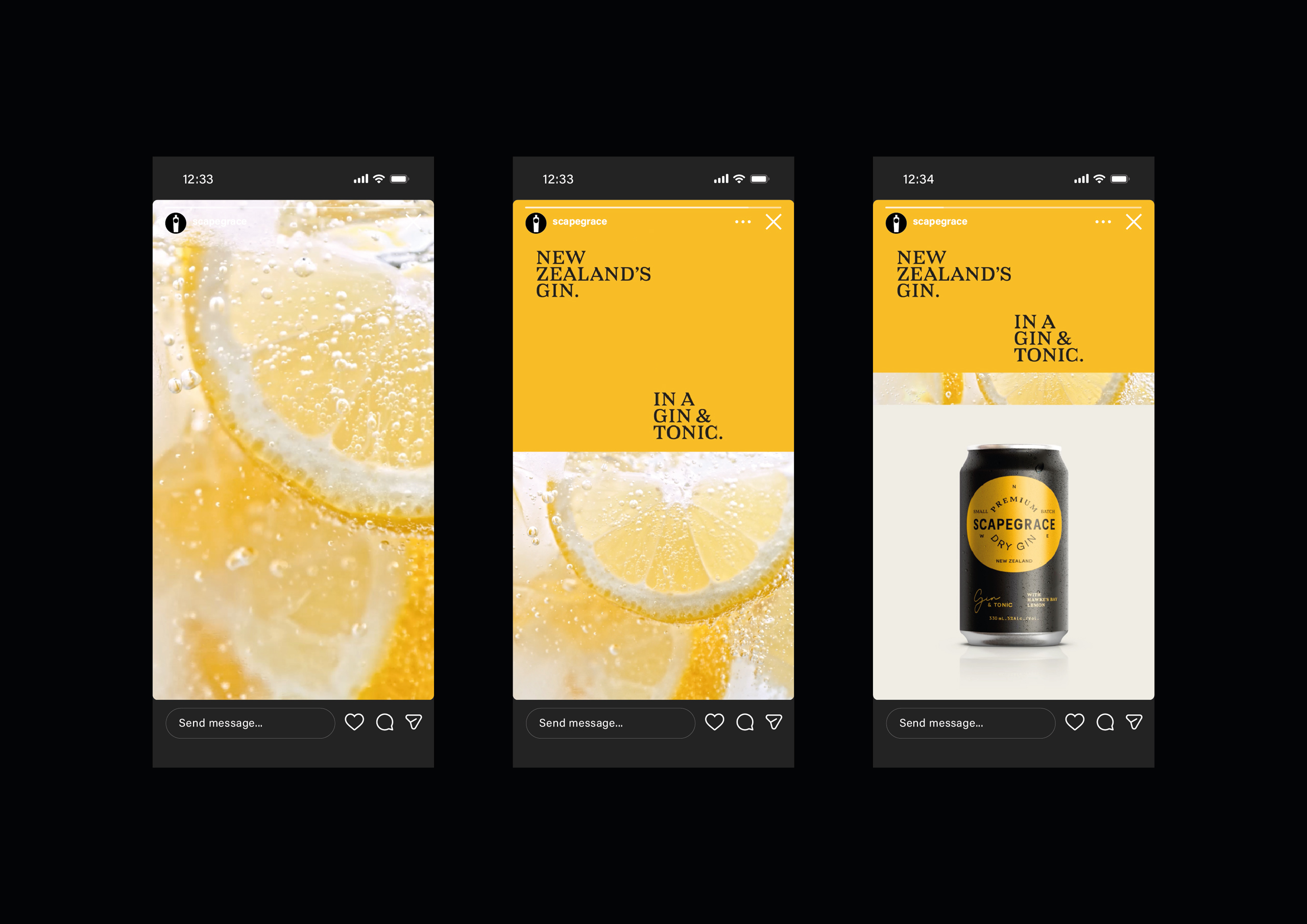
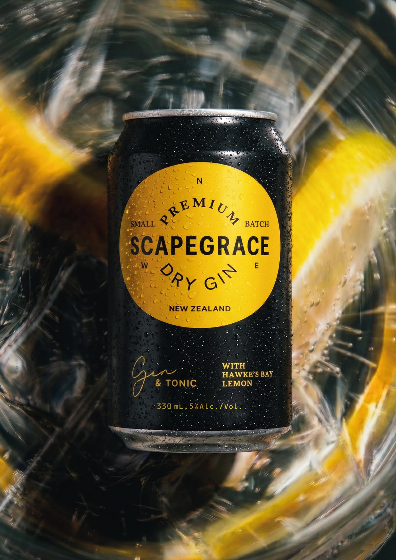
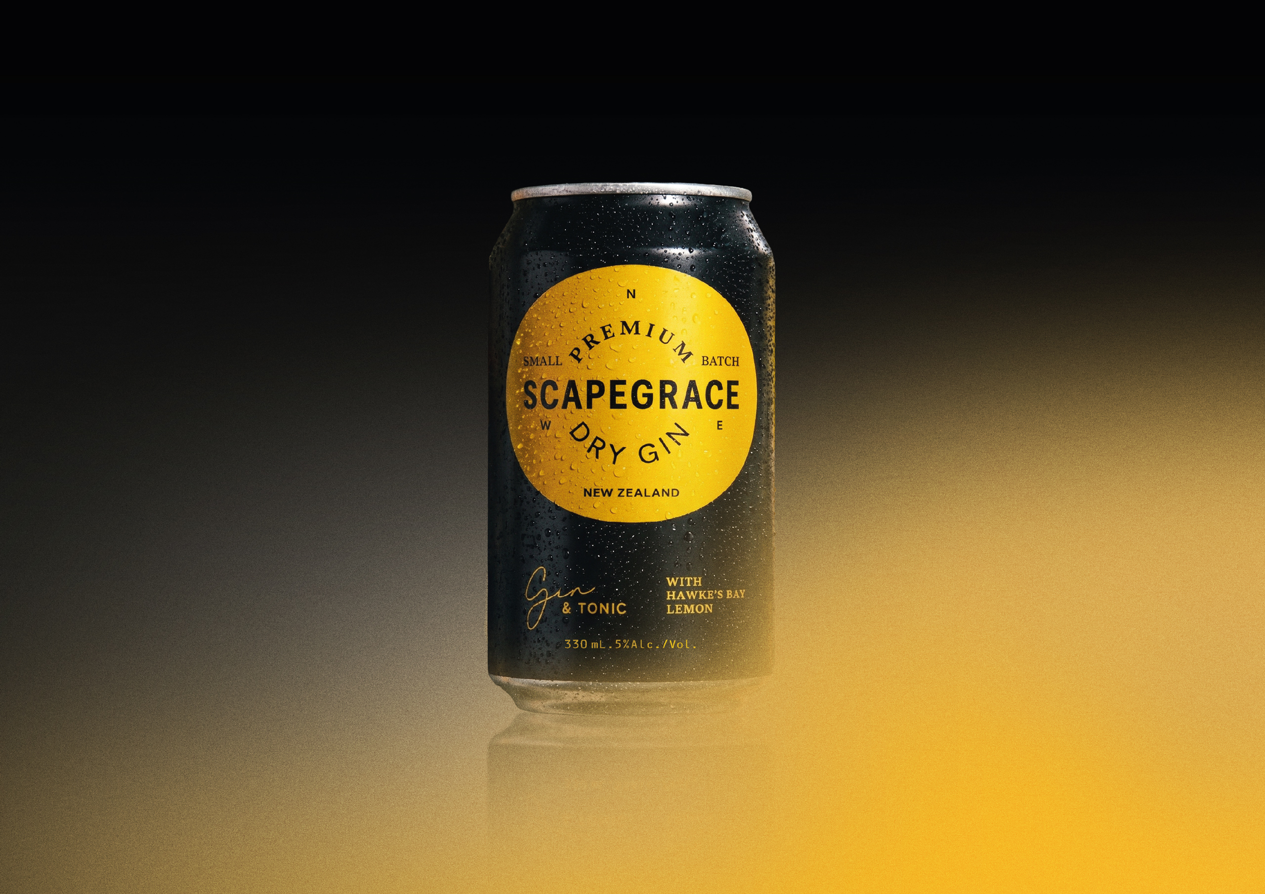
A predominantly black can leverages the Scapegrace brand colour while differentiating from the lighter, brighter RTD category. Combined with a restrained typographic hierarchy, the result is a timeless design that reinforces the brand's premium credentials.