TERRA SANCTA
Special Release Rosé
2018
Food & Beverage
PROJECT SCOPE
Brand Identity
Packaging
AWARDS
NZ Best Awards – Finalist (Design Craft)
NZ Best Awards – Finalist (Packaging)
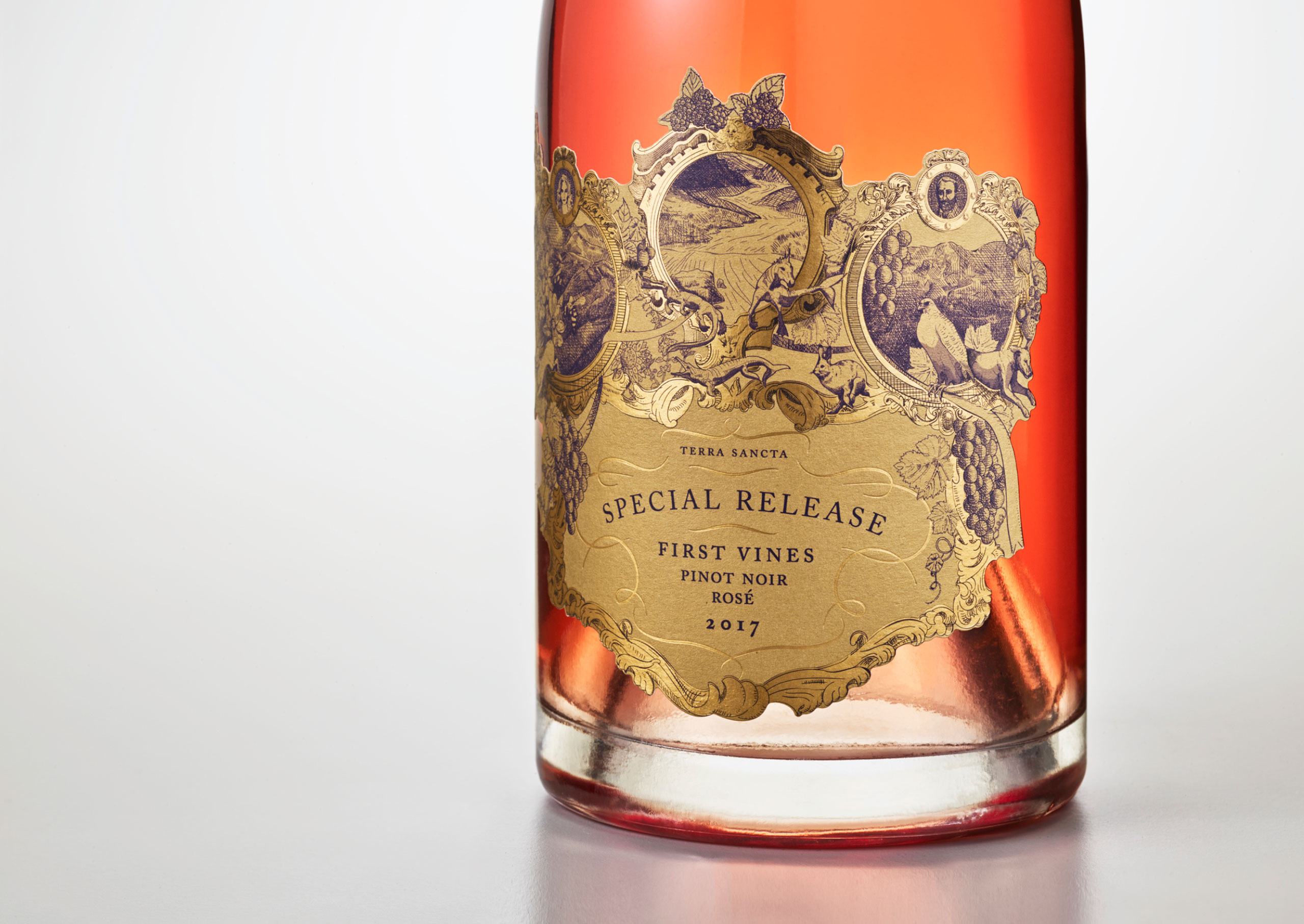
We were tasked with designing this premium New Zealand Rosé, to sit within the Terra Sancta portfolio.
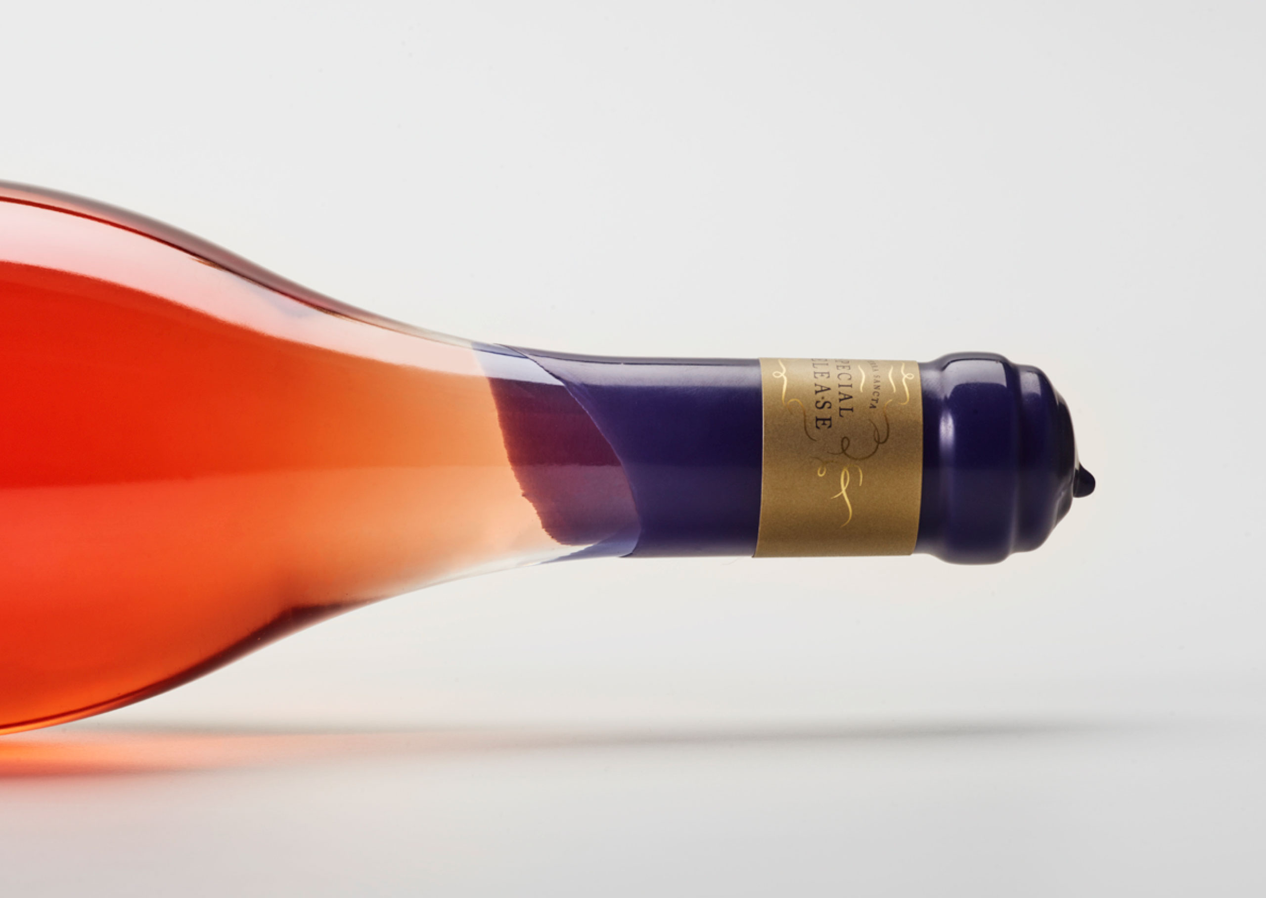
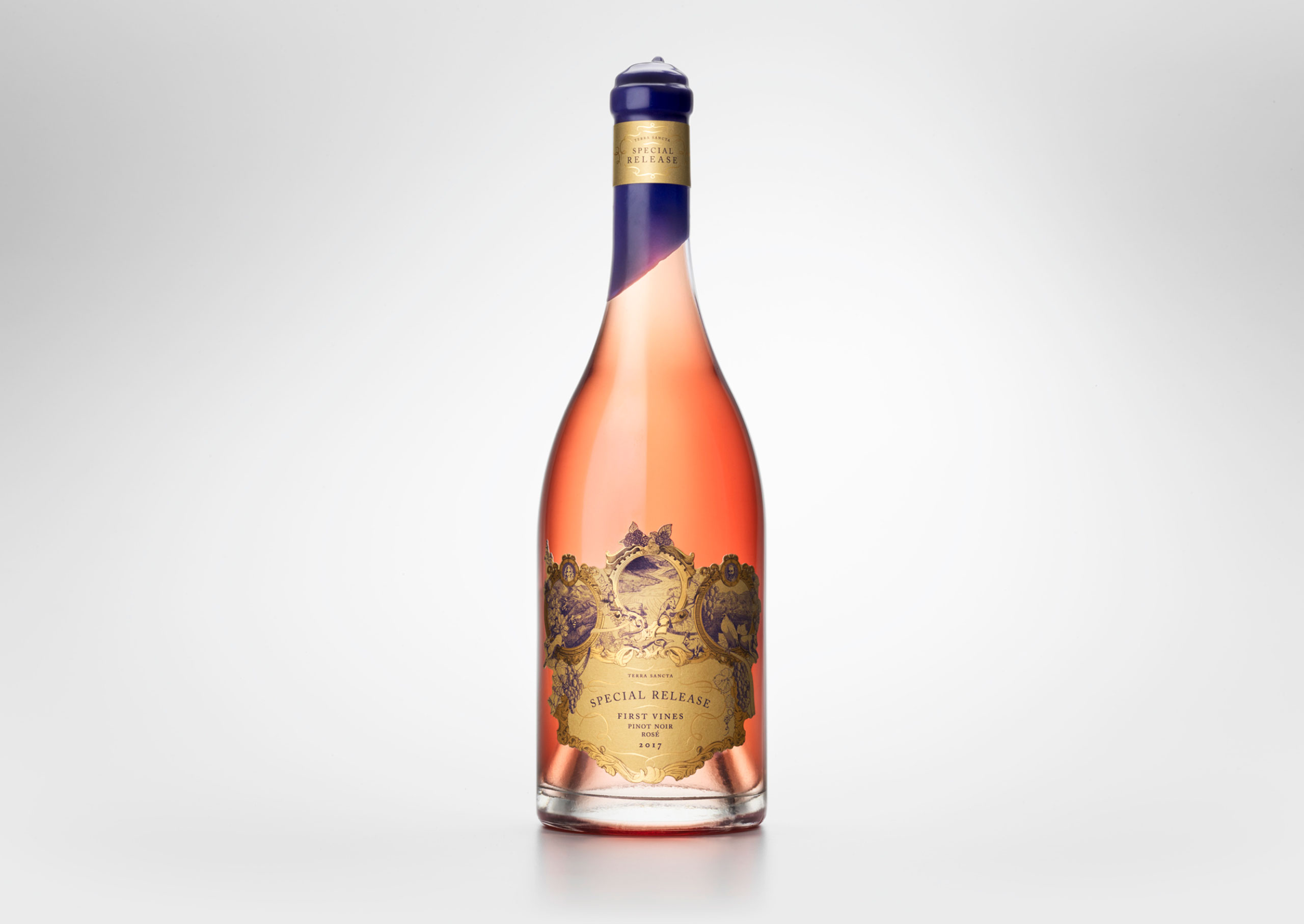
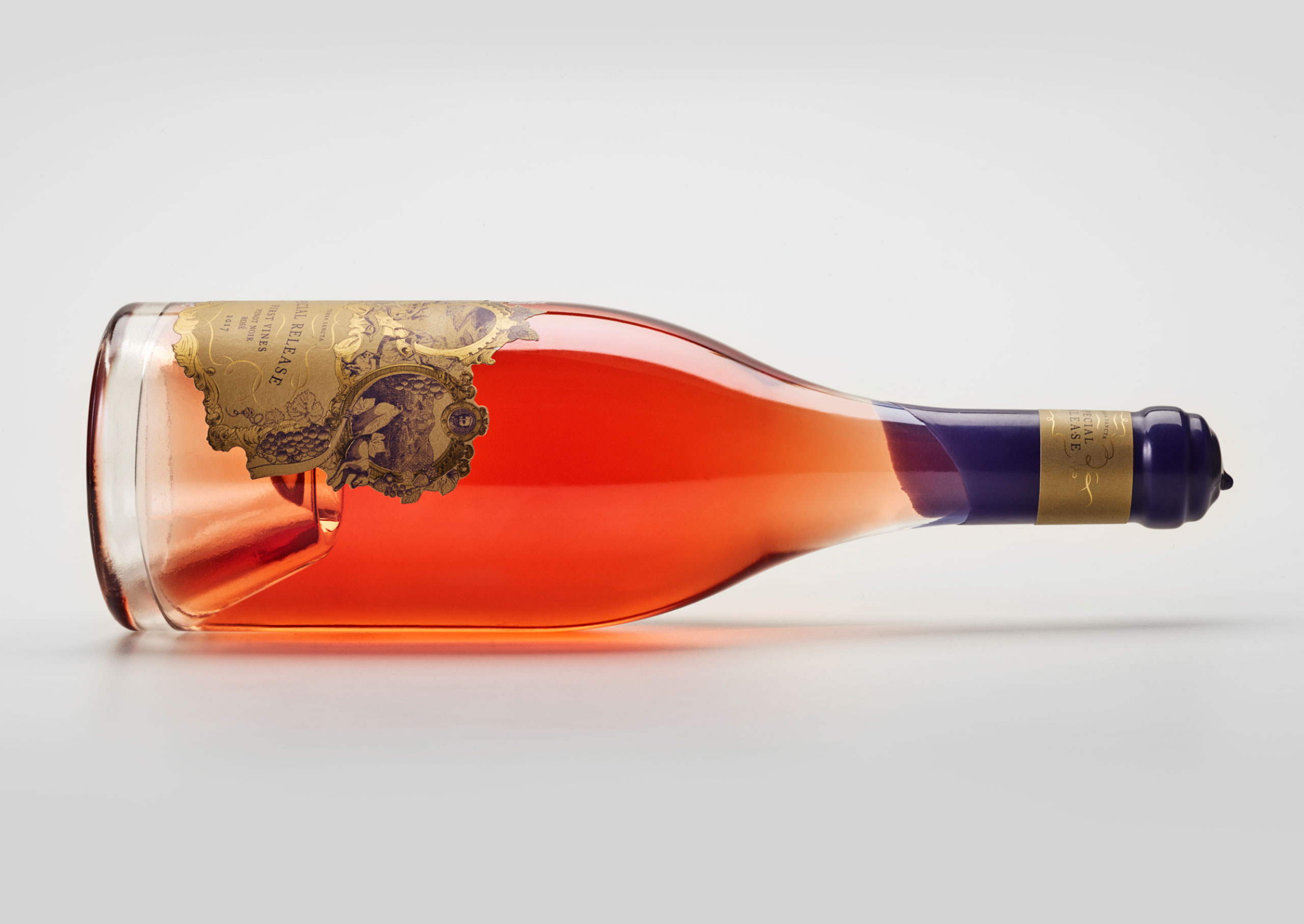
The bottle with an accentuated punt at its base was chosen for its grandeur. The clear glass allowed the Rosé juice to create a stunning ombré effect through the punt shape and neck area. The thickness and weight of the glass alone looked and felt substantial in the hand.
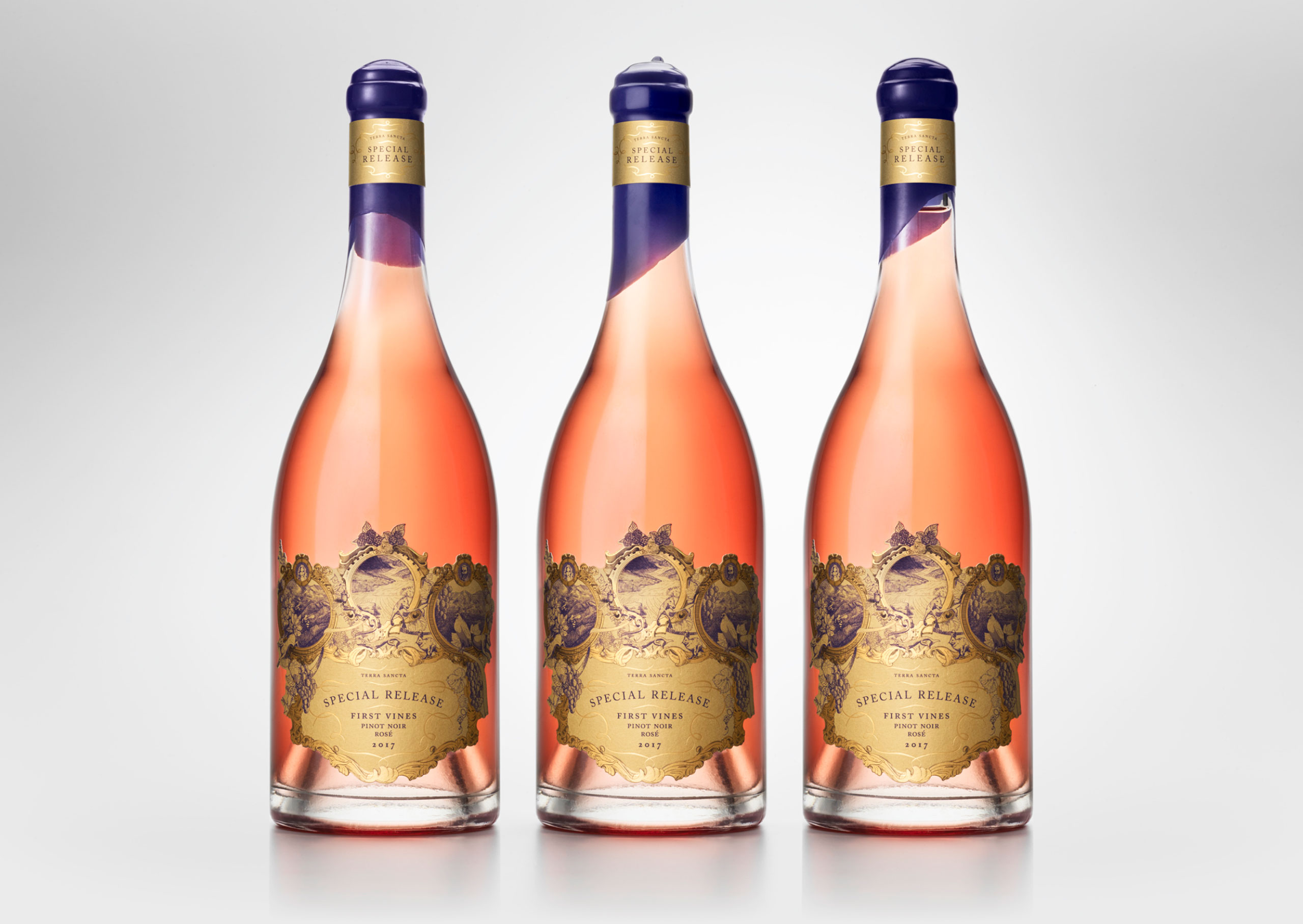
The label remained true to the style of the Terra Sancta Estate range, illustrating allegorical imagery of the land—the place of origin—in the style of an ancient cartouché. The cartouché concept itself reflects the age of the land and its history, and lends itself to providing a detailed narrative with key symbols of the estate. The detailed etch-style linework is reminiscent of old wine and cognac labels. The elaborate dieline was chosen to house the detailed imagery and uphold the use of an intricate label shape, in which Terra Sancta holds visual equity.
A maximalist approach was taken to contrast an abundance of contemporary minimalism evident in the category, and therefore embellishments were essential to ensure the prestigious positioning of the product