BALD HILLS
Brand & Packaging Design
2026
Food & Beverage
PROJECT SCOPE
Brand Identity
Packaging
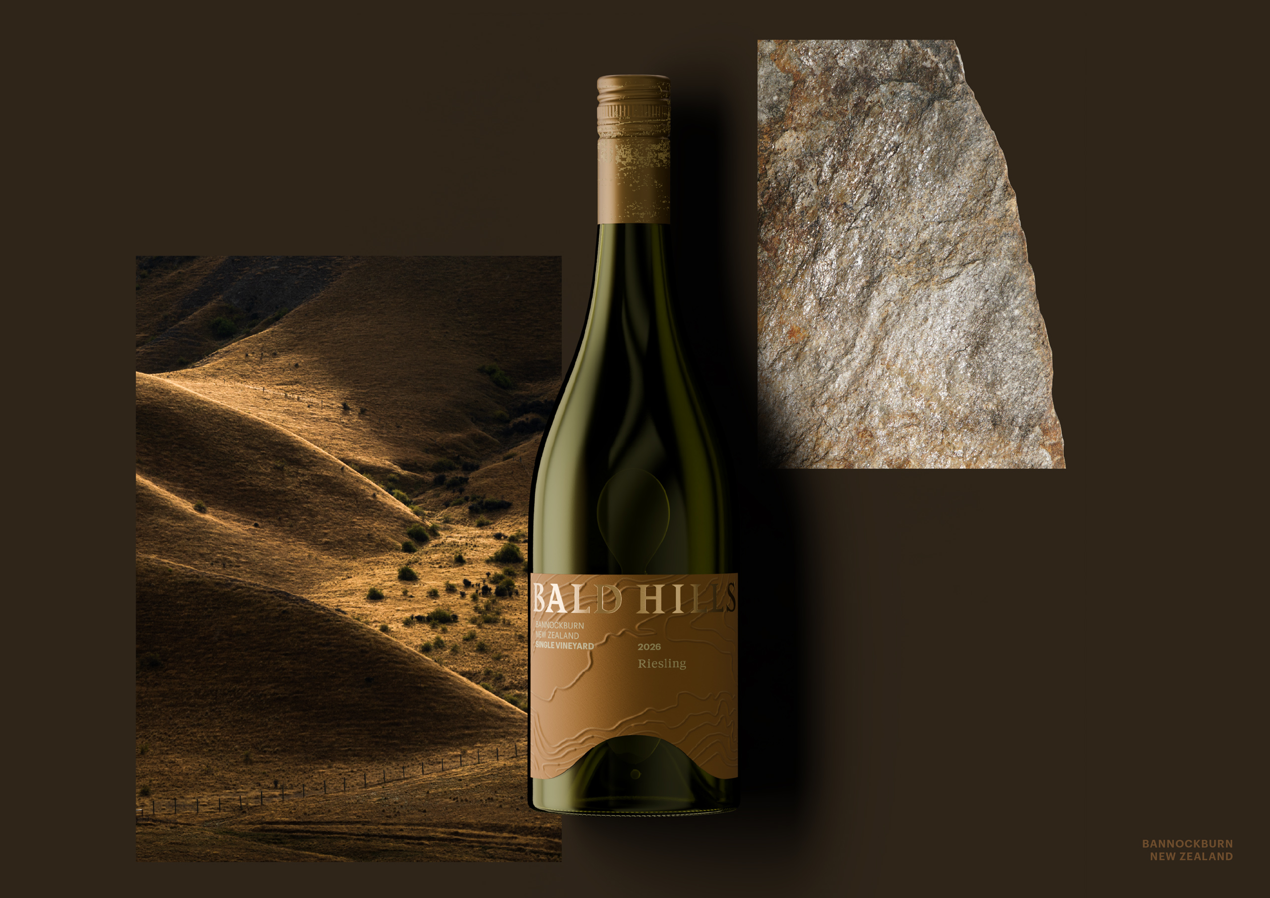
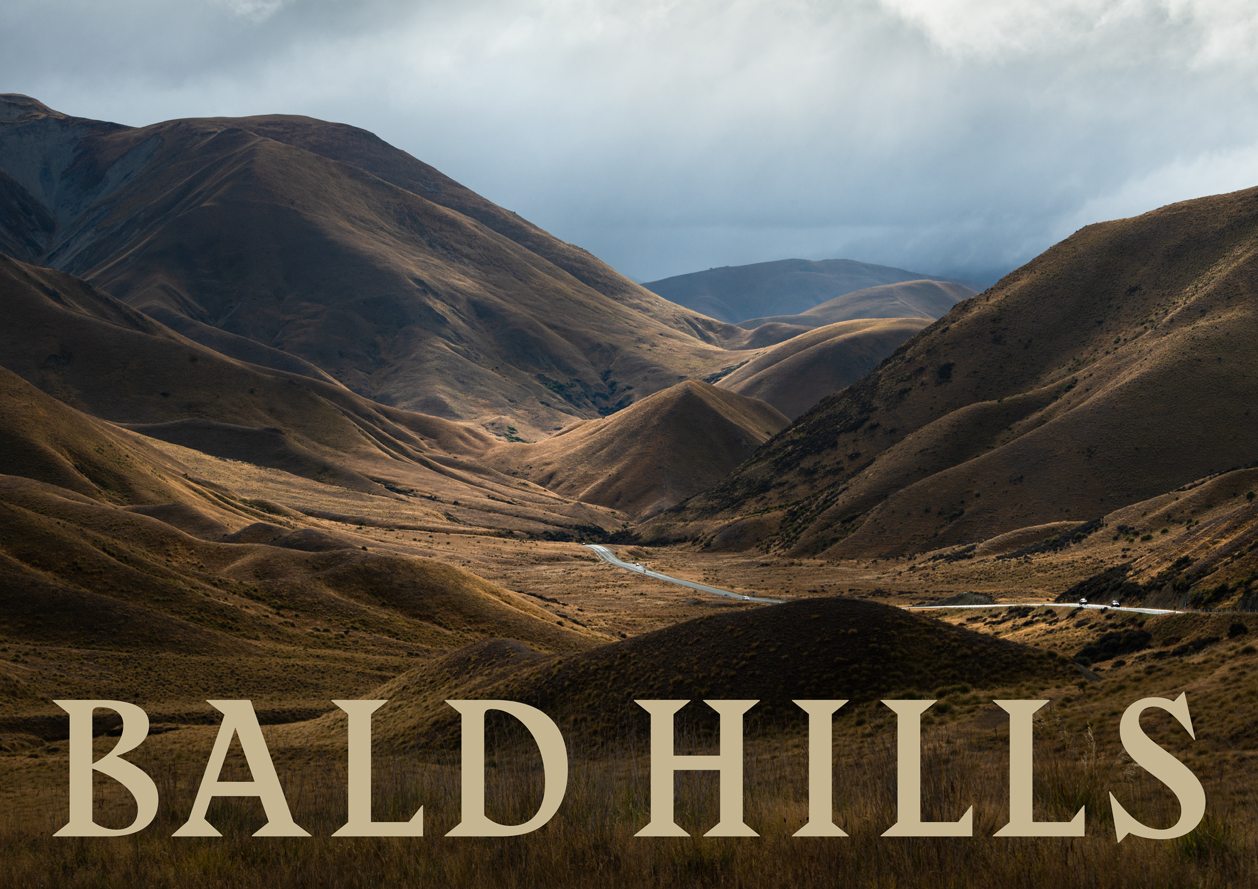
In 1997, beneath the mountain ranges of Bannockburn, a site was chosen for its ability to produce exceptional cool-climate wines. From this rugged terrain emerged Bald Hills, a vineyard shaped by the dramatic geology and bare hills that define the landscape.
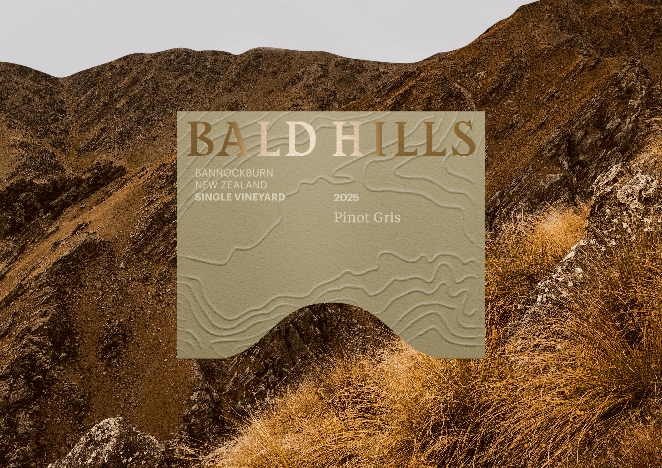
Starting with a notably memorable brand name, the strategy was to lean into the name as place, and therefore lead with the land. We distilled the brand to its most recognisable asset, the landscape that gives Bald Hills its name. A simple hill form became the central idea and unifying element across the range, transforming a defining geographic feature into a distinctive brand asset.
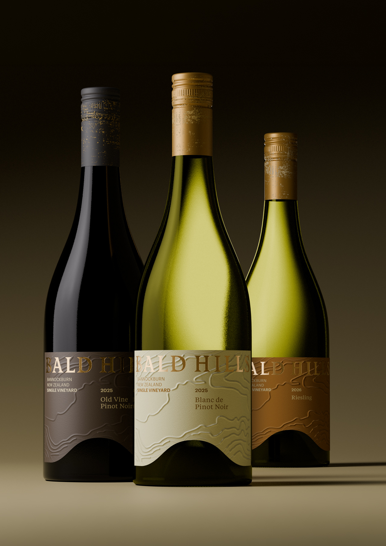
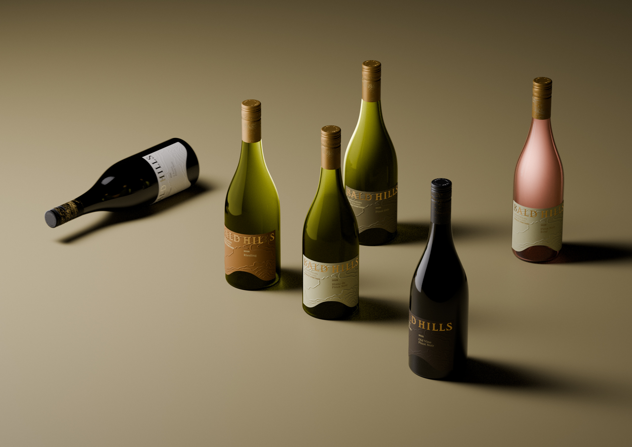
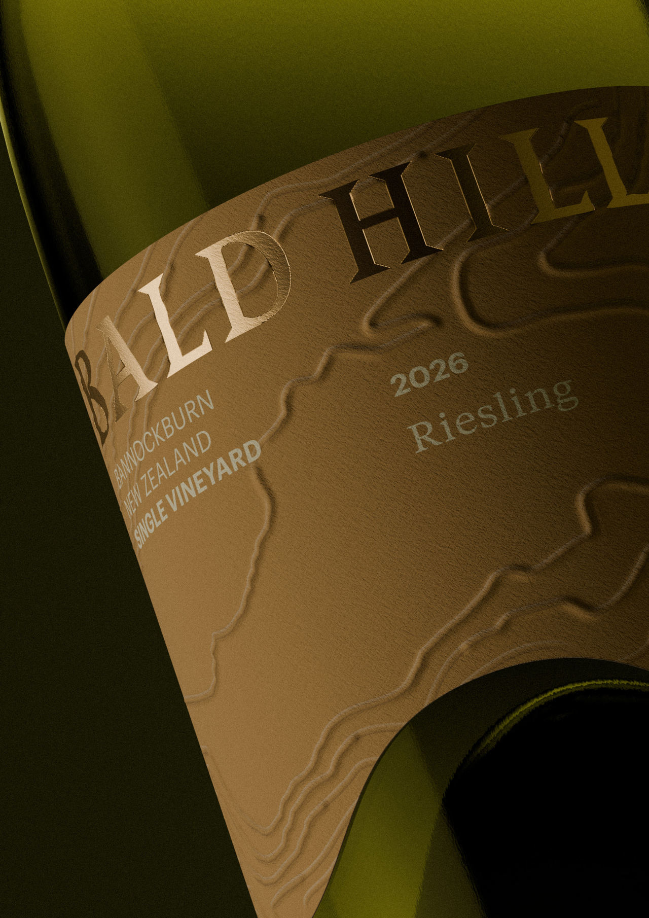
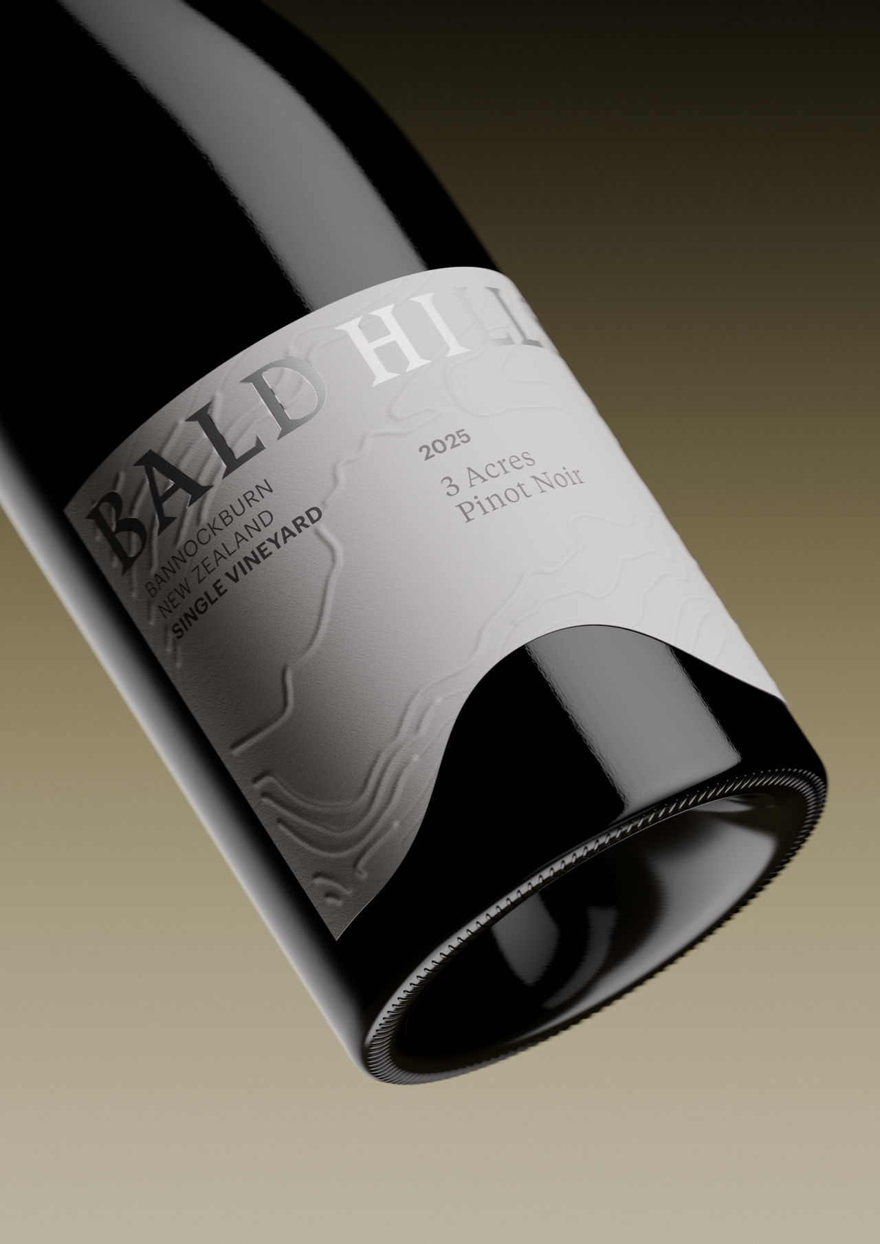
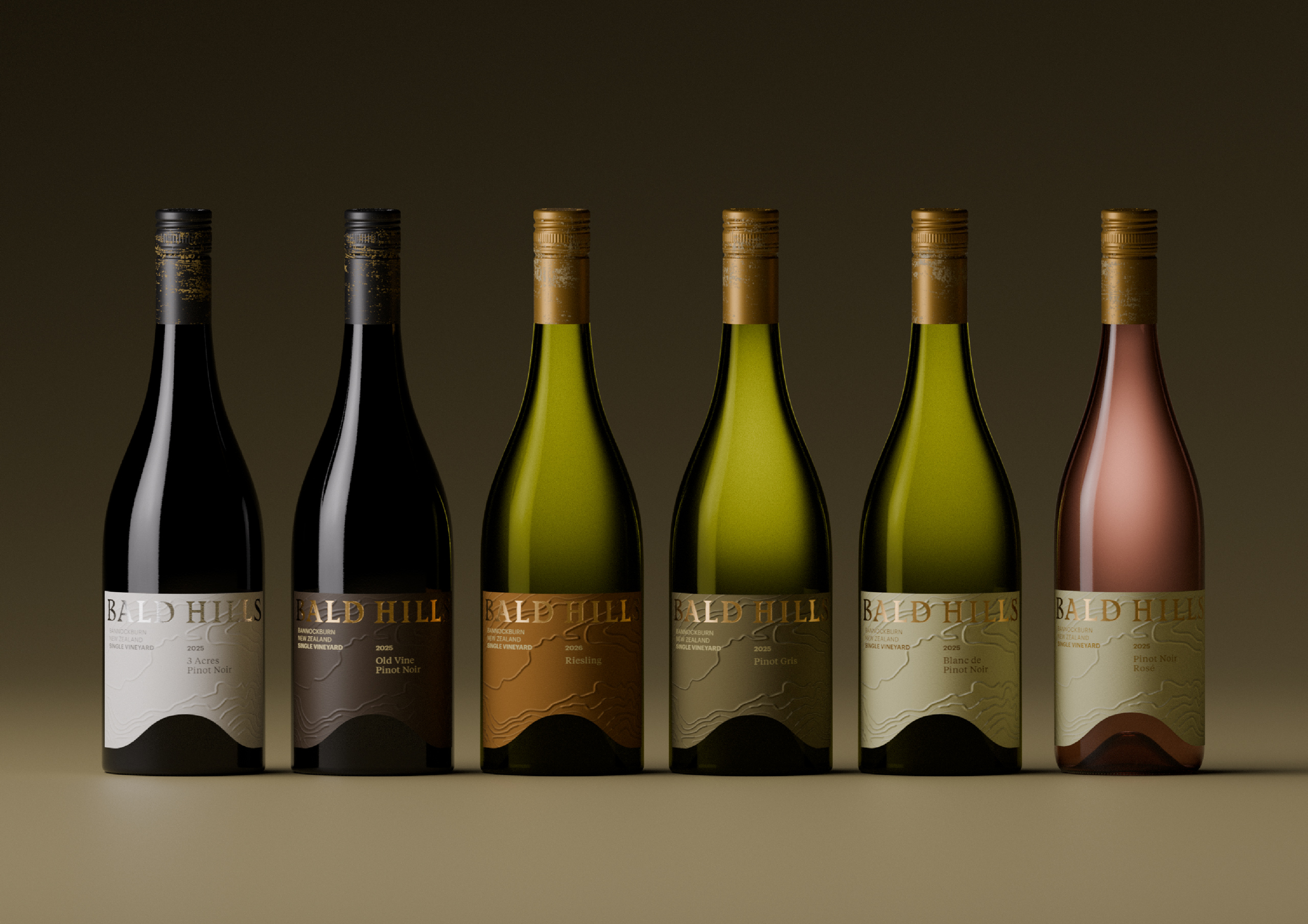
The landscape is embedded directly into the packaging. A hill-shaped die cut is carved from the label, revealing the glass punt beneath and drawing the eye downward into the bottle’s form. Repeated across the range, it creates a distinctive and unified visual signature.
Grounded in place yet quietly expressive, the design delivers an enduring identity that strengthens recognition while celebrating the terroir of Central Otago.