SEALORD NAKED
Brand & Packaging Design
2025
Household (FMCG)
PROJECT SCOPE
Brand Identity
Packaging
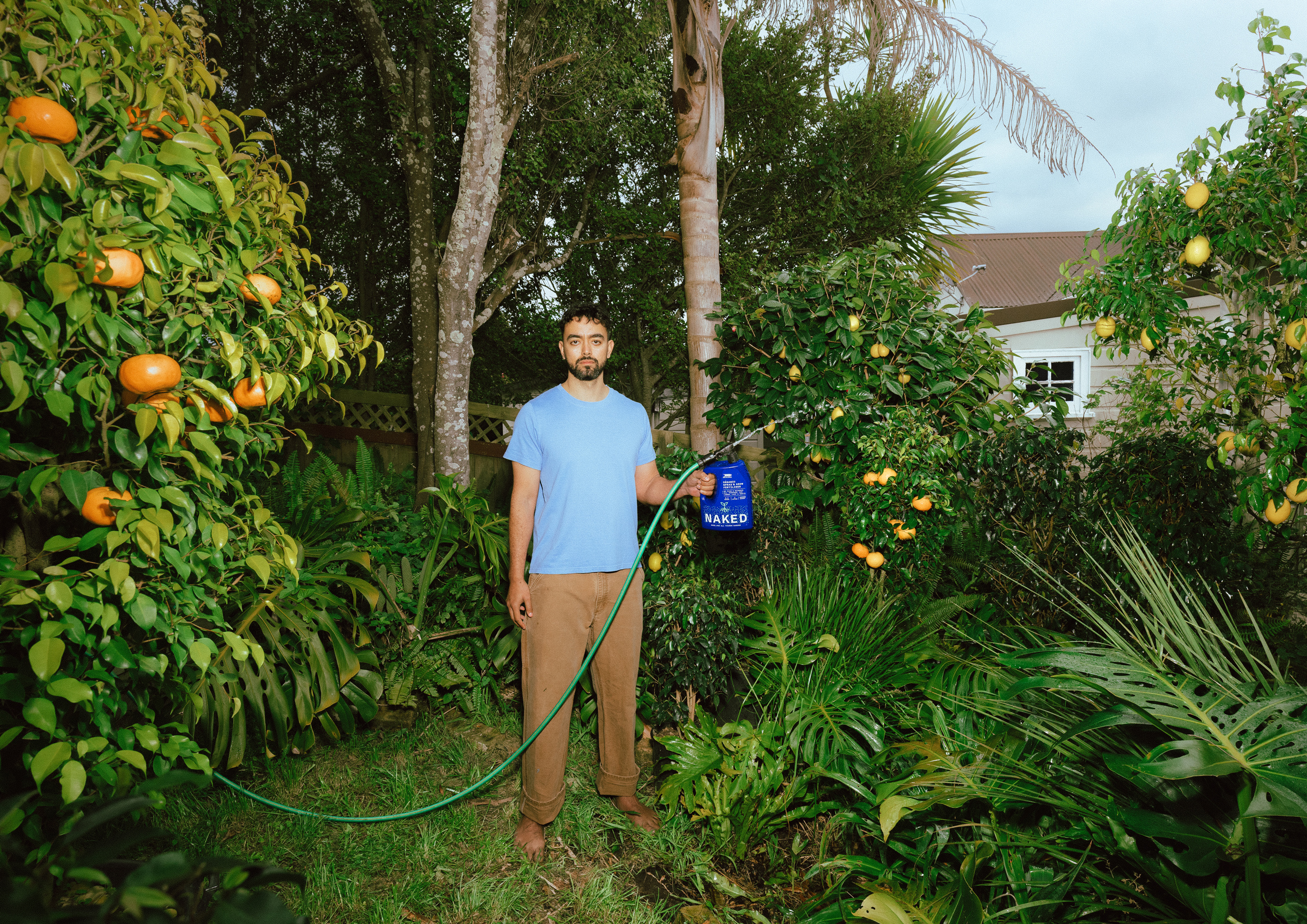
Sealord identified an opportunity to transform fish by-products into a high-performance fertiliser for home gardeners across Australia and New Zealand.
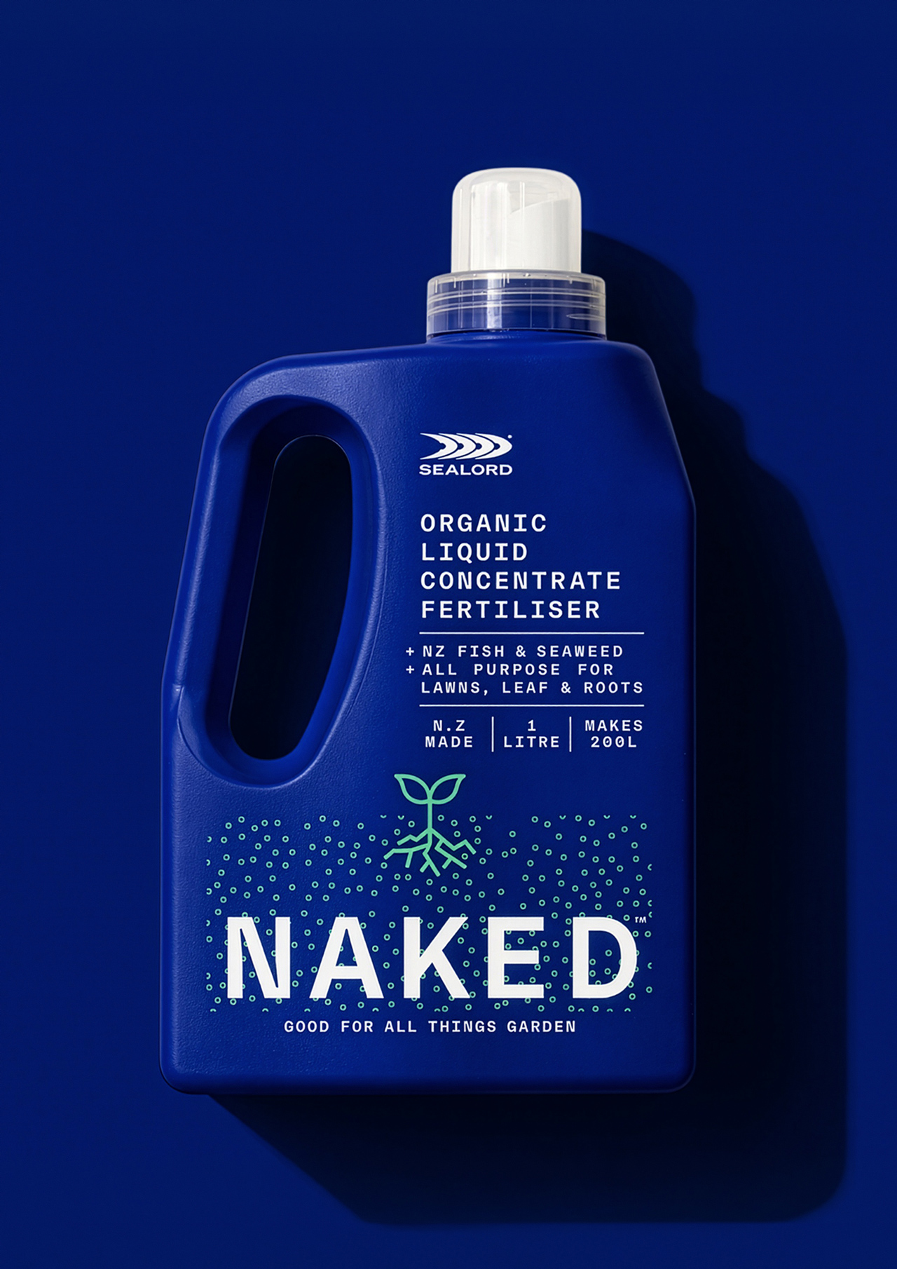
Entering a category crowded with technical claims and familiar brands, the strategy centred on simplicity. "NAKED" became both the name and the idea, stripping away complexity to create a brand that feels clear, approachable and confident.
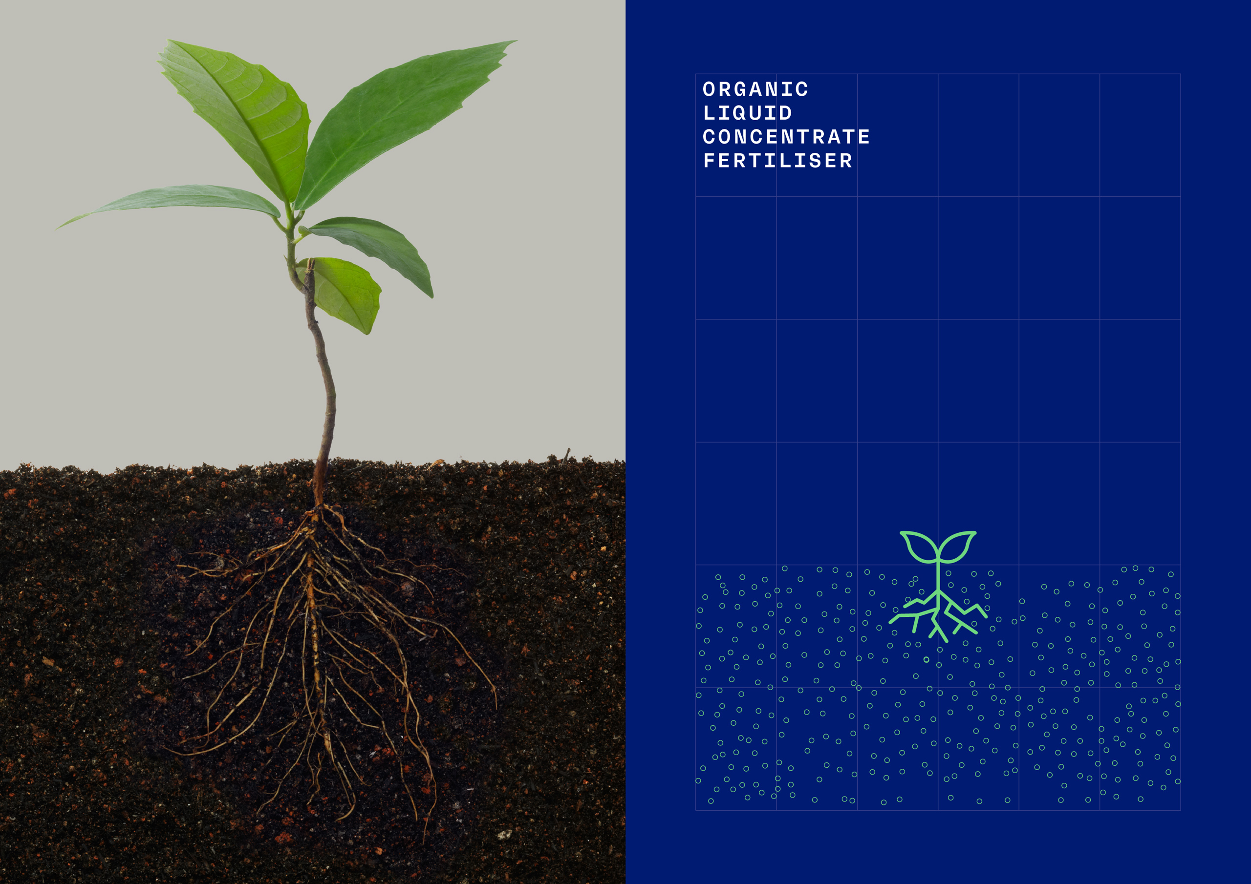
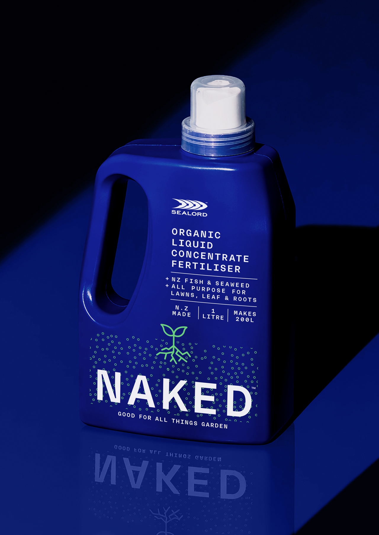
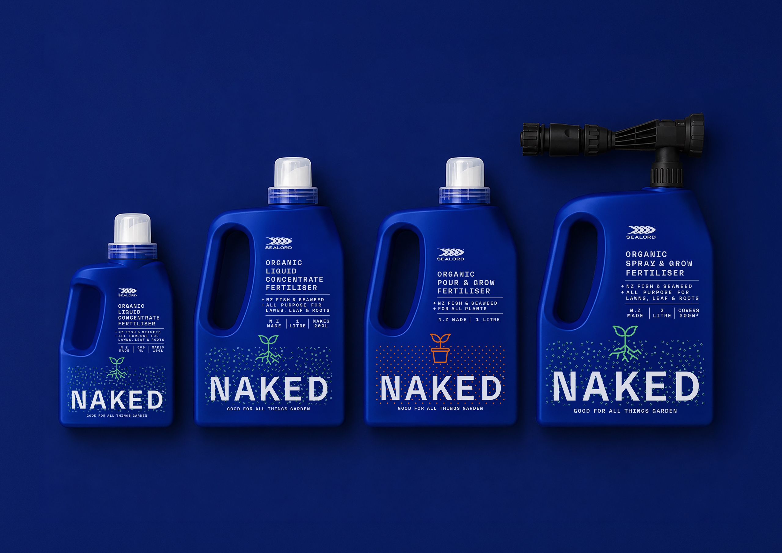
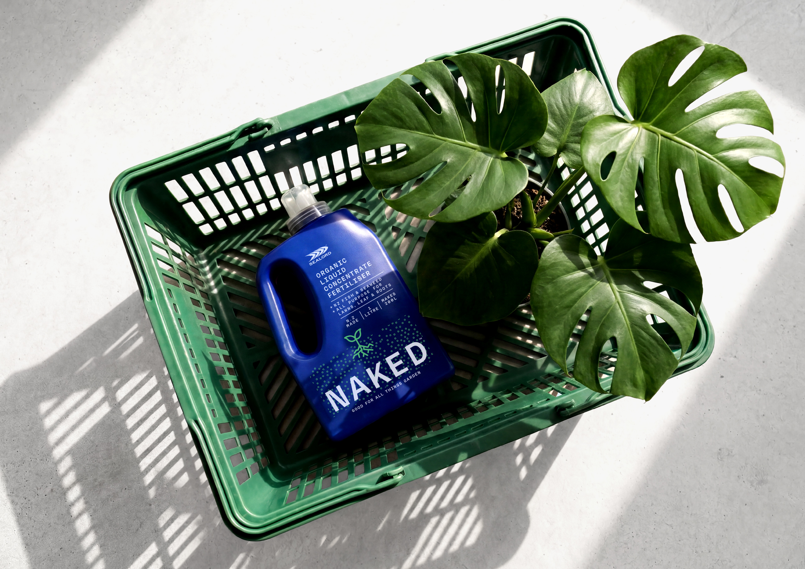
The packaging is deliberately reductive. Sealord's signature deep ocean blue stands apart on shelf, while benefit-led messaging and a simple root-inspired graphic create an intuitive system that differentiates the range and supports future growth.
By turning a production by-product into a valuable gardening resource, Naked repositions fertiliser for a broader audience, making plant nutrition easier to understand without sacrificing credibility.